The Case for Changing the Way You Tell Stories
By Mike Beaudet, Anna Campbell, and John Wihbey
Unpacking Data in the Reinventing Local News Project
So much local news coverage is tied to the news cycle at a time when audiences are also expecting insights, context, impact, and an understanding of stories as they unfold.
This means that the 700+ local TV news stations across the country are increasingly missing opportunities. But it’s not too late.
In our research series here at RTDNA (see Part I and Part II), we’ve been building the case that new forms of storytelling, particularly next-generation animation, are vital to meet new audience expectations and norms. In this post, as well as the accompanying slide deck, we hope to provide an in-depth look at the data we gathered and the topline takeaways for how graphics and animation can enhance local TV news storytelling. We hope you’ll dive in and see there’s a powerful case for breaking the mold.
What are the general takeaways to consider as you consume this information? As we examine the data, we hope you’ll remember two themes in particular:
- Dealing with complexity: First, the current era demands a pivot from reacting to the news cycle to managing a protracted coverage cycle with an emphasis on context, trends, and outcomes. Graphics and animation assist in the understanding of more complex issues, as they can capture sequences of events, illustrate geography, aid in comparison, and connect the dots. They enable a deeper understanding, and a higher level of retention, of the facts at hand.
- Active audience choice: Second, local news consumers are taking a more active role in their news consumption, flowing between brands and platforms to get the content they need. The fragmentation of news and the decline in allegiance is as much a response to frustration as it is to motivation. Accordingly, our data suggest younger audiences are responding to strong visuals; we find strong preference for the animated approach, especially for the younger demographics (ages 18 to 24). Importantly, our research reveals that enhancing broadcasts with graphics and animation can both attract new viewers as well as continue to satisfy––and even impress––a station’s loyal core audience base, even in this volatile news environment.
We present these insights based not only on partnerships we facilitated with TV stations, but also on a rigorous experimental survey, conducted with more than 1,000 respondents across the Chicago and Boston markets.
Methods & Meanings
In the research, we partnered with analytics firm SmithGeiger and showed more than 1,000 TV viewers four news stories, all drawn from their specific market and produced with the help of the Visual Content Producers we embedded in newsrooms at WLS-TV ABC7 Chicago and WCVB-TV NewsCenter 5 Boston. For the experimental survey, some of the videos were left “as is,” with the animated segments in them; we also created alternate versions with the animation stripped out, converting back to the traditional or “conventional” format.
Half of the videos each respondent saw were animated, and half conventional; the final video appeared in a social media frame. For the first two video exposures, the same news story was seen twice: half saw the animated version first, half saw the conventional version first. This process was randomized to control for effects like novelty or fatigue.
The demographics of our sample: It was 56% female, 44% male; it was 74% white, 12% Black, 9% Latino, 8% Asian; about one-third were ages 18-34, while 30% were 35-44 and 40% were 45-54. These proportions were designed to mirror the general makeup of the news market in each region. We present our entire summarized slide deck of data here for your review. Please feel free to get in touch if you’d like us to walk you through it. As you review the data, consider these three thematic insights.
- Attributes of storytelling and appeal: Animated and graphical stories outperform conventional stories in several diverse categories
- Clarity and understanding of details: Stories enhanced with maps, graphs, and visual statistics such as charts helped our viewers both (a) feel they were being delivered the right amount of information and (b) actually retain more facts from the story
- Impact on news behaviors and attitudes: Videos with graphics and animation outperform conventional ones for reasons to watch local news, story relevance and quality of storytelling
- Surfacing new preferences and attracting new demographics: News consumers recognize the value of the enhanced graphics and animation once they get a taste; intriguingly, news consumers become less satisfied with the more conventional way of delivering news stories
The findings below have implications not only for stations trying to target or improve products with regard to certain demographics, but also for station strategists thinking about volatility and affinity––how to make sure loyal viewers stick around while also pulling in the “surfer” crowd, which flips channels for the most interesting coverage.
Favorability & Interest Metrics
Respondents in our survey indicated that they preferred the animated versions of the stories they were shown to the conventional ones by a 24% margin. They gave the animated stories a thumbs up upon initial impression and categorized them as more “interesting to watch.” The animated video versions also beat out the conventional in specific descriptive categories such as “well crafted,” “visually interesting,” “innovative,” and “direct and to the point.”
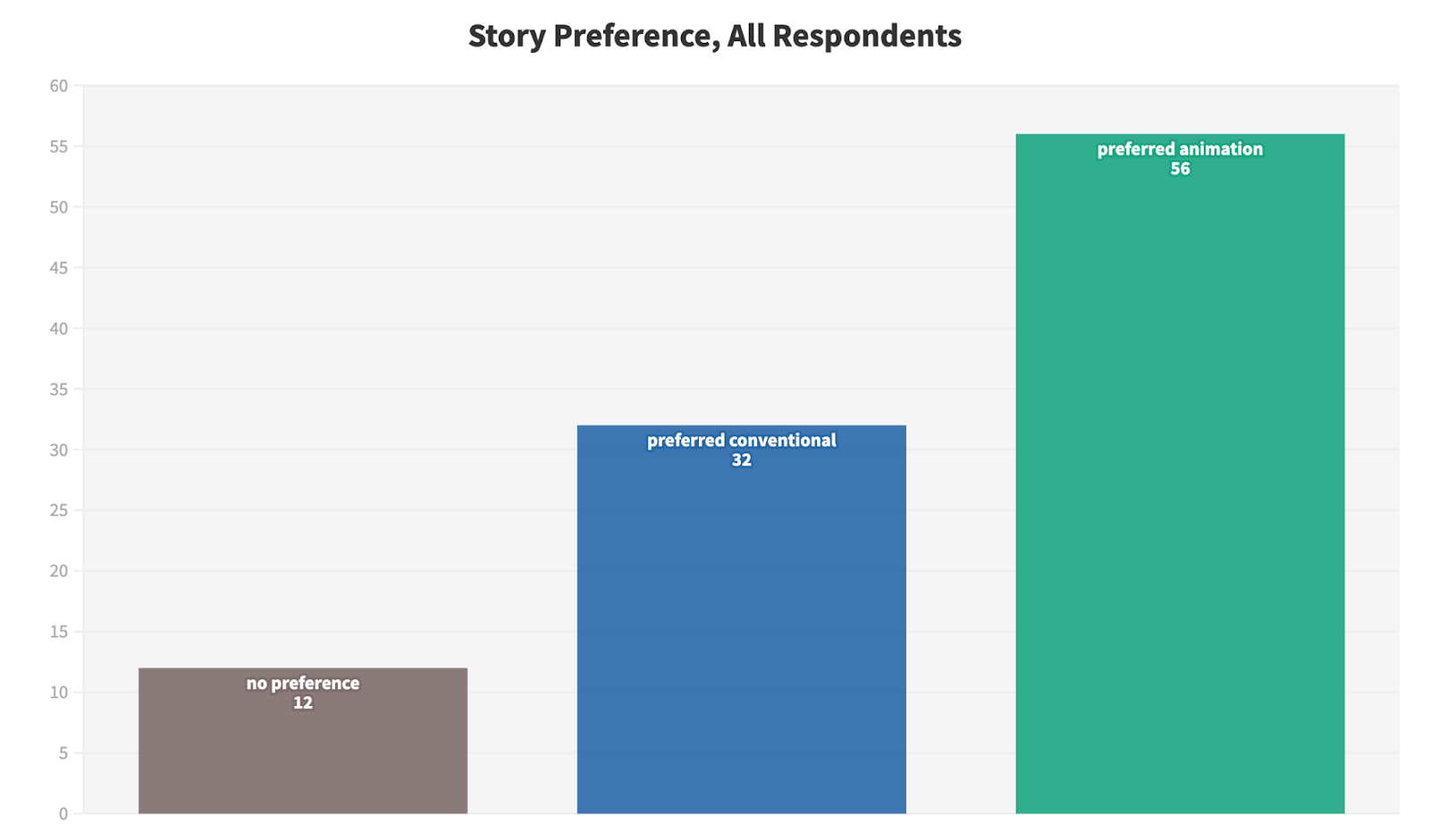 Respondents preferred the animated versions of the stories by a 24% margin in total
In particular, viewers appreciated the clarity, relevance, and more resonant tone that graphics and animation delivered. Common themes that appeared in our open-ended responses included that animation made the video easy to understand, broke up the story, and showed more impactful and compelling detail with tools such as maps and graphs.
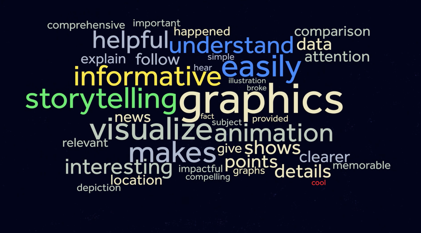 Subset of keywords used in open-ended responses, asking why the animated version was preferred
Before members of our survey saw the example videos, “having an innovative look and feel” and “using compelling graphics to illustrate a story” were identified as relative vulnerabilities for local news, with respondents––especially younger women––ranking these as some of the elements that local TV is least effective in delivering.
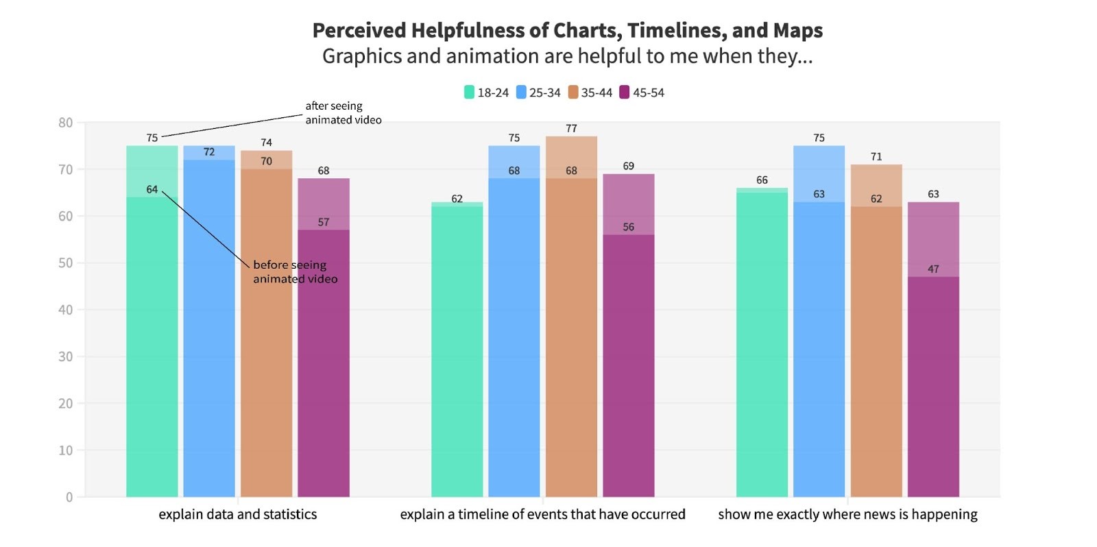
After we showed participants the videos, the potential of graphics and animation in local news became even more apparent. We saw a significant increase in the proportion of people who said that they liked to see graphics and animation included in news stories, and would be more inclined to watch a particular program, a station, or local news programs more generally if they improved the quality or quantity of graphics. Timelines and maps in particular earned our storytelling a ~10% leap in perceived “helpfulness” of explaining events before and after seeing the animated approaches in our sample.
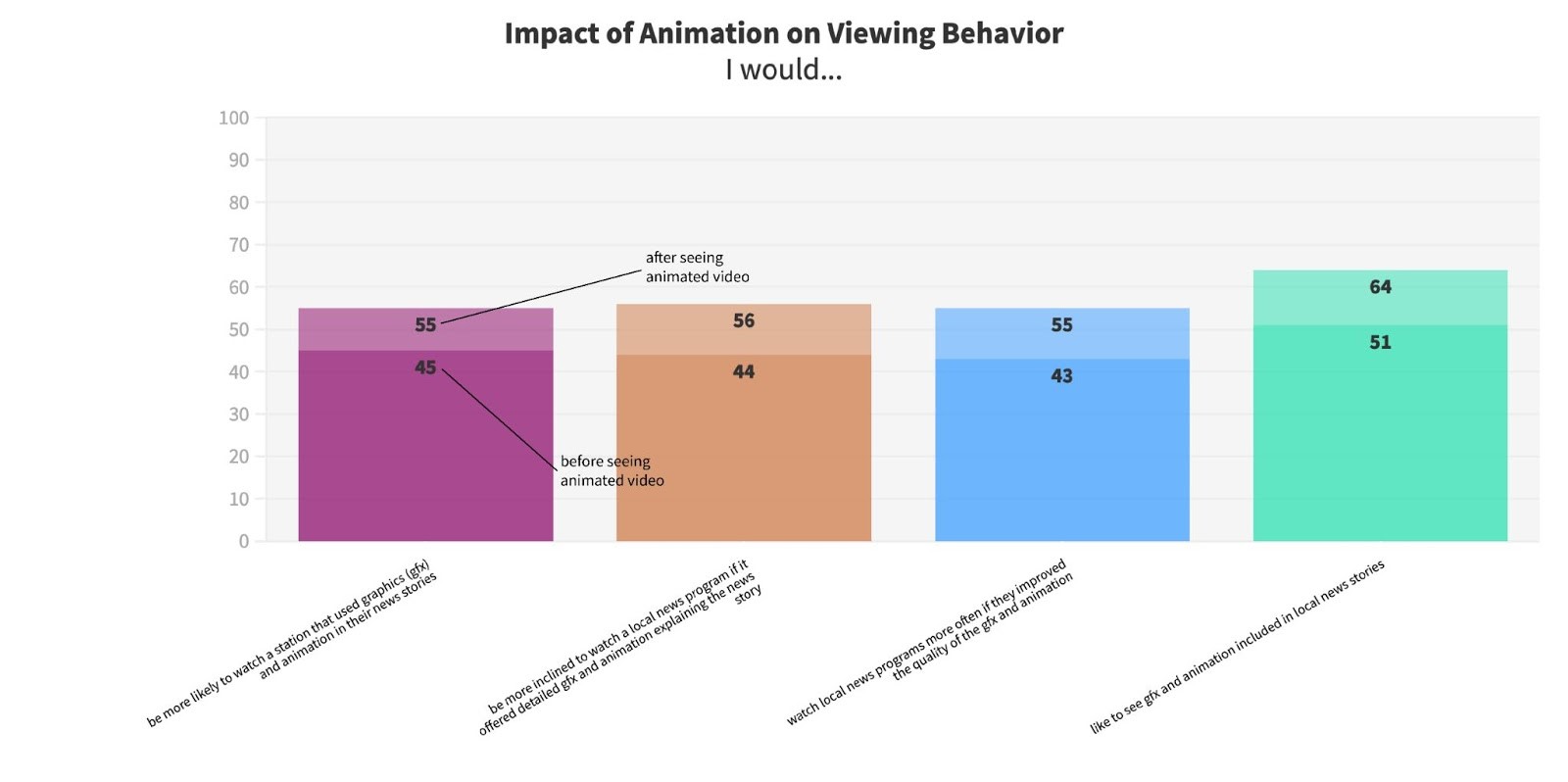 Seeing the animation examples increased the likelihood our viewers said they’d come back for more
Amount of Info & Memorability Metrics: Spotlight on Infographics & Data Viz
Animation consistently helped viewers absorb information more efficiently, both by their own estimation and as evidenced by quantitative retention tests. Viewers indicated they felt that the animated stories more often included “the right amount of detailed information” as opposed to overloading them with granular detail or leaving them with more questions than answers. As one viewer put it, the animated version of a story about a super spreader event in Chicago “more clearly showed how many people [were] infected” with the coronavirus. A story about a small plane crashing off the freeway was described as “easy to follow” and “familiar” when maps and text-based graphics showing the location and time of the incident were added.
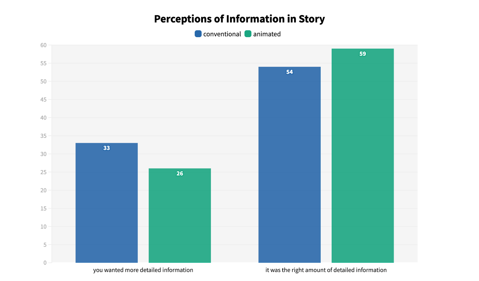 Viewers were more satisfied with the amount of information animation delivered by animation
But we didn’t just ask respondents how much information they felt they retained; we actually quizzed them on specific elements of the reporting to see how much they remembered accurately. Animated versions with charts, maps, and animated segments showing a sequence of events increased correct answers by participants to these questions by 2-3% across the board. That may not seem like much, but every step stations can take to amplify the accurate reporting they work so hard to produce is a win in light of dwindling attention spans, the rapid spread of misinformation online, and an increasing rate of exponential and abstract phenomena like global health and climate change affecting public life in very concrete ways.
We also observed some interesting demographic trends when narrowing our results to those videos that included animated statistical comparisons, timelines, and maps. Charts and visual statistics are most helpful to the 18–24-year-old demographic; maps are most helpful to the 25–34-year-old demographic, and visual timelines are most helpful to the 35–44-year-old demographic. Interestingly, the 45–54-year-old demographic showed the biggest jump in ranking these graphics as “helpful” before and after seeing all three types of videos, suggesting that while this group’s expectations for broadcast graphics were initially quite low, they were consistently the most impressed with the value added by animation and graphics.
 Charts, timelines and maps are helpful to viewers across demographics
This applied to trust as well, with visual statistics and maps significantly increasing the amount that 45-54-year-olds indicated they would trust the content of a broadcast. We also found that adding visual statistics, timelines, and maps can build the trust of the 35-44 demographic, consistently pushing it over the 60% mark.
Growing Diversity & Impact
For stations looking to expand the racial or gender boundaries of their audience, we found evidence that innovation in storytelling could be a winning strategy. Findings along these lines include:
- Female viewers in general recognized the untapped potential of graphics, with a 17% increase in the number of responses favoring animation as a regular part of a broadcast.
- African American viewers expressed an affinity for graphics and animation that grew by 21% after seeing the experimental videos, with the proportion of this group that indicated visual statistics and timelines were helpful surging from under 57% up to 75%.
- Hispanic viewers, and viewers of all ethnicities in an income bracket above $100,000 per year also indicated that they would be more likely to watch local news in general, if it offered detailed graphics and animation routinely, by a significant 18% margin.
Further, for new viewers (5 years or fewer in their respective market), seeing our videos increased the perception of the power of graphics to explain a story’s impact on them personally by 10%.
What's Next
In our final post here at RTDNA, we will provide some concrete recommendations for stations to enhance and expand their storytelling with next-generation animation and graphics in both daily and longer turn investigative pieces.
If you’re interested in the project, please don’t hesitate to reach out to us. We would be happy to advise, chat about our experiences, or hear about yours. You can meet some members of our team in the webinar in Post I. To see some exploratory data visualization, particularly of the top reasons different demographics tune into local TV news, check out our student project here. If you are interested in hosting a workshop in-person or virtually at your station to learn more about hands-on recommendations and even get some motion graphics templates to start your team’s animation journey, please express interest via this form. You can also contact project lead Mike Beaudet at m.beaudet@northeastern.edu.
Mike Beaudet and John Wihbey are professors at Northeastern University’s School of Journalism. Anna Campbell is a Video Innovation Scholar in the graduate program at Northeastern. Beaudet is also an investigative reporter for WCVB-TV Boston.